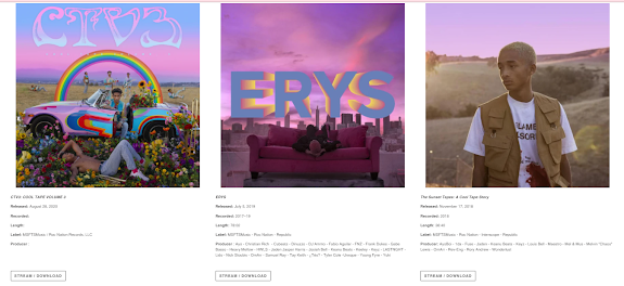
Homepage
The main image on the website immediately established Jaden Smith as the artist. In terms of layout, the website seems to take on a minimalist, easily navigational approach. Notably, the colour scheme of the main image is complimentary to the rest of the website and his 'artist logo' at the top right; this creates a concrete house style of the website and perhaps tells us about the artist's personna
A range of merchandise is presented when you scroll down on the home page, again the colour scheme is complimentary of the overarching style that the site is going for. These pieces of merchandise promote, also, Jaden Smith's latest album release and would be very highly regarded by his fans. By having a saturated purple and blue colour palette, the artist is strengthening the concept of his latest release.
Interestingly, some shots from the music video appear on the home page, accompanied by text at the bottom right which seems to be snippets from the video's screenplay. It outlines the artist's position, action and location. This will especially be appreciated by avid fans who can have this exclusive content only on the website. These shots in particular are close-ups of the star, as expected from a high label artist.
At the bottom of the homepage is all of his album releases along with some information about each one. These 'information cards' show clearly his achievements and previous releases. Once again, a consistent theme is present with the concepts, anchoring his artist personna very clearly, giving him an identifiable and original style.
More of these information cards about his releases can be found on the 'MUSIC' page of the website
A key convention of musician's website is the mailing list and further social media links. This allows the artist's fanbase to grow and offers exclusive content, deals and notifications to those who join the mailing list.
Gallery page
The gallery page on the website I found particularly interesting as it was home to many shots from behind the scenes of the music video. These pictures are candid shots taken during the shooting due to them being blurry and shot on a handheld camera. Nonetheless, the shots show the artist to be fun and happy, reflective of both his music and his brightly themed concept. Notably, all the models and people in the shots are wearing the official merchandise. This product placement simultaneously promotes the artist and their merchandise.
Genre-wise, the artist is a rapper, but this concept is unusual for this genre, being very childlike and colourful as opposed to the dark and serious tones as expected of rap. By challenging these premonitions, the artist is freely showing his creativity with a new and fresh look, perhaps even rebranding the genre altogether with his own significant style.


No comments:
Post a Comment